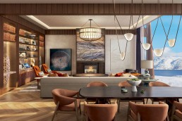
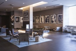
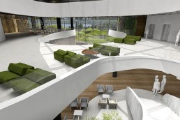
Amsterdam-based multidisciplinary design studio concrete has unveiled its interiors for the newly opened W Osaka, Japan’s first W Hotel.
Each W hotel is designed for its specific location – with foreign designers invited to offer the fresh perspectives of an outsider. For W’s first hotel in Japan, Concrete absorbed the sights, sounds, flavours and thrills of Osaka.
From the simple beauty of the cherry blossoms and gingko trees lining Midosuji Boulevard to the vibrant neon and busy streetscape of Osaka’s nightlife district Dotonburi, Concrete found inspiration in both the simple and traditional, as well as the modern, obsessive and extravagant and created a design concept of extravagant simplicity, celebrating the true spirit of the city.
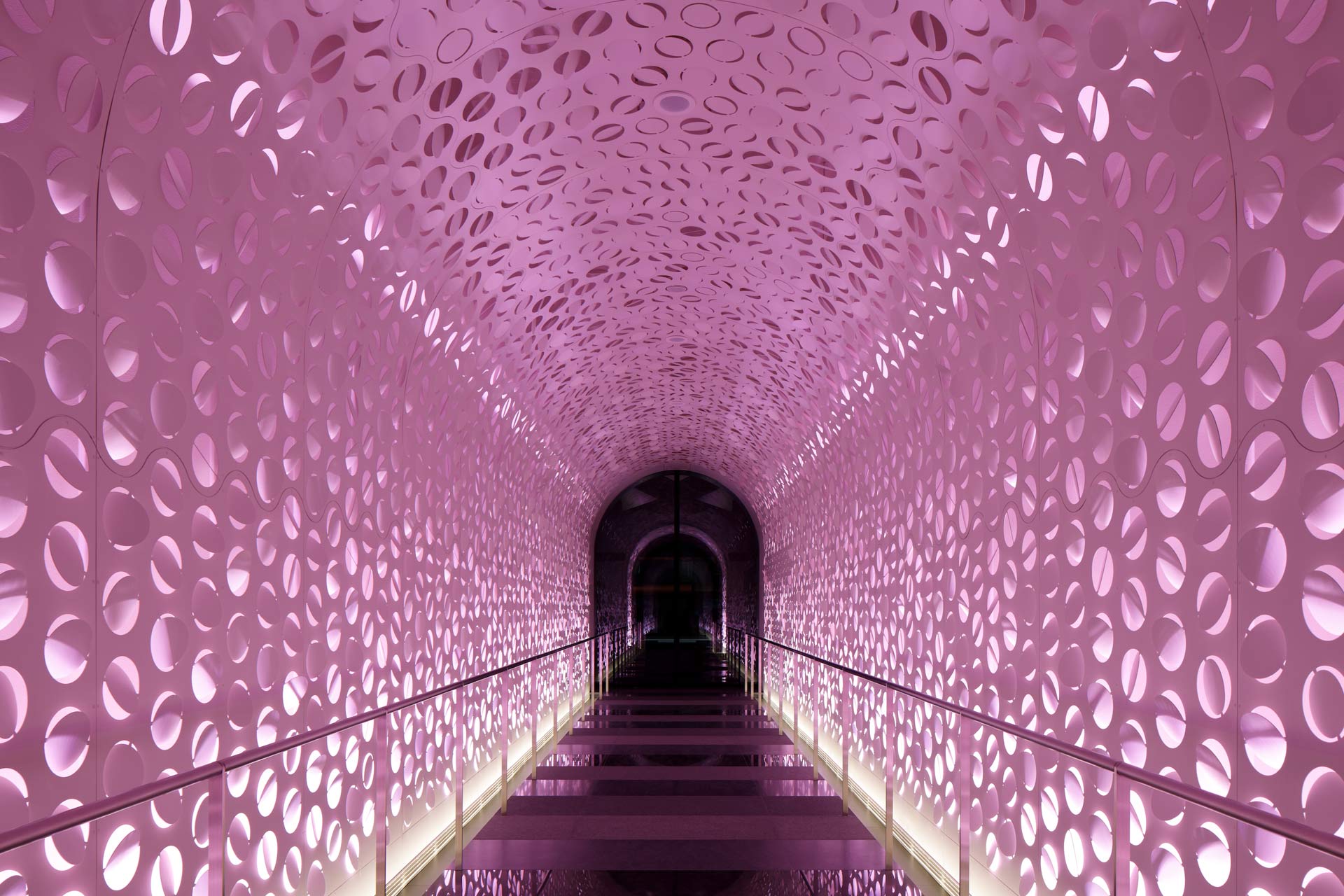
The “wow” experience begins as guests enter the long arrival tunnel from the main Midōsuji Boulevard entrance. Inspired by delicate blossoms and the fine art of origami, more than 3000 circles were laser cut into sturdy metal and folded randomly. The lights behind the abstract blossom change colours with the four seasons and shift in intensity from day to night, creating an otherworldly portal into the world of W Osaka.
Inspired by the asanoha pattern, the arrival lobby boats a simple yet bold ceiling uses a scaled-up, 3D version of this traditional geometric pattern – which is reflected in the pattern on the granite flooring, in 6 dark grey shades.
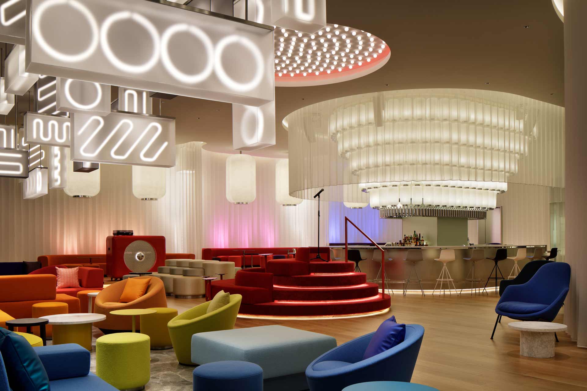
When exiting the lift, W Osaka guests are immediately faced with the bar, the social heart of the hotel. To connect and separate the spaces on this floor – like an endless shoji screen – a continuous white, sheer curtain with sharp origami-style pleats flows around the room.
The Living Room blurs the boundaries between indoors and outdoors. Above the indoor lounge floats a wild cloud of rectangular lamps, hanging vertically and horizontally, at various heights. White zigzag “neon” lights shine through the translucent acrylic forms, in a desaturated homage to Osaka’s electric nightlife scenery.
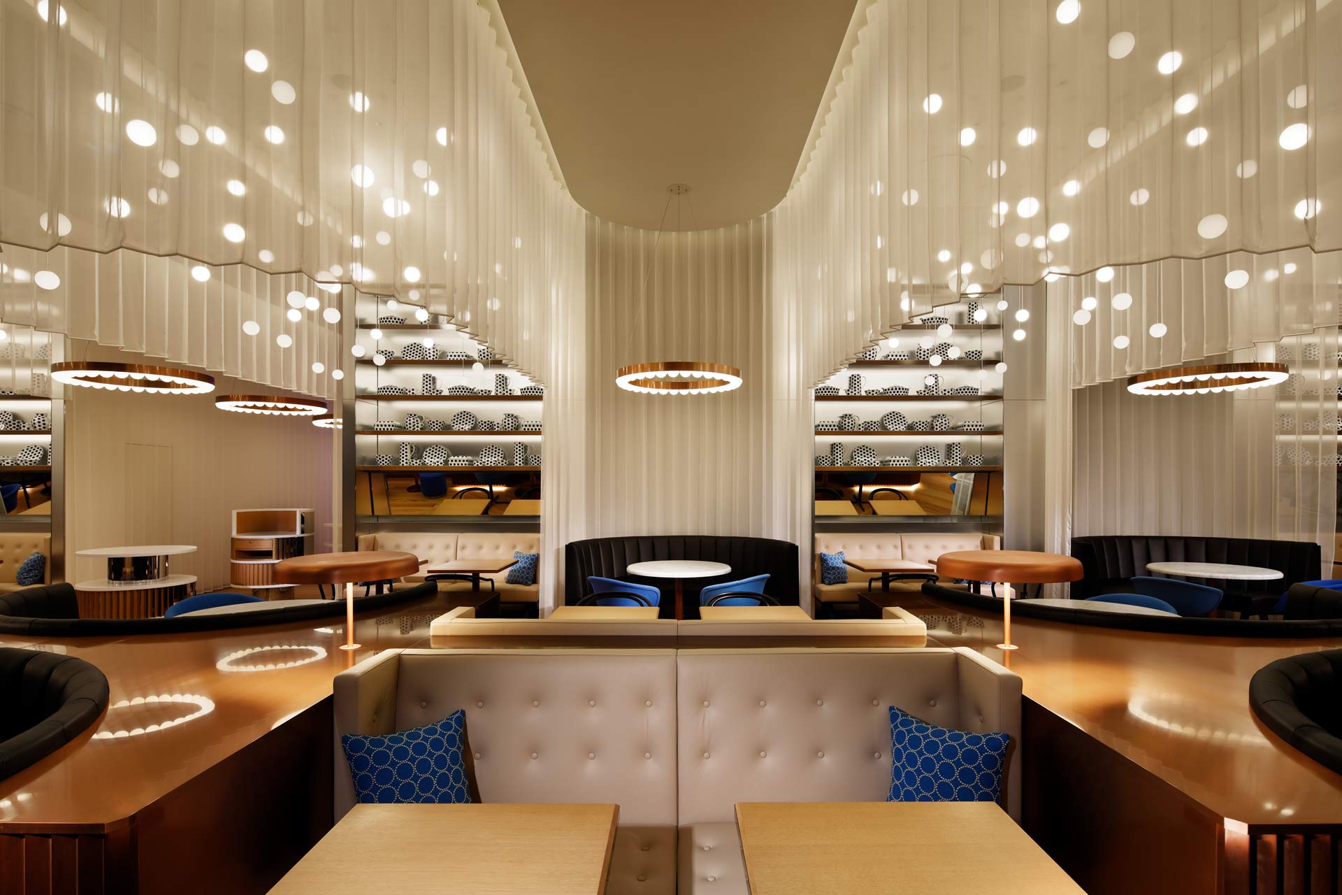
French themed bistro-diner oh.lala draws its inspiration from traditional copper pots and pans, as well as the typical Breton blue and white striped shirt. Along the wall stainless steel shelves are styled with unique porcelain objects decorated in blue dots – combining traditional French shapes and colours with the circle motif of W Osaka. Adding sparkle from above, are clouds of small ball pendant lights, suspended at different heights within the waves of the curtain.
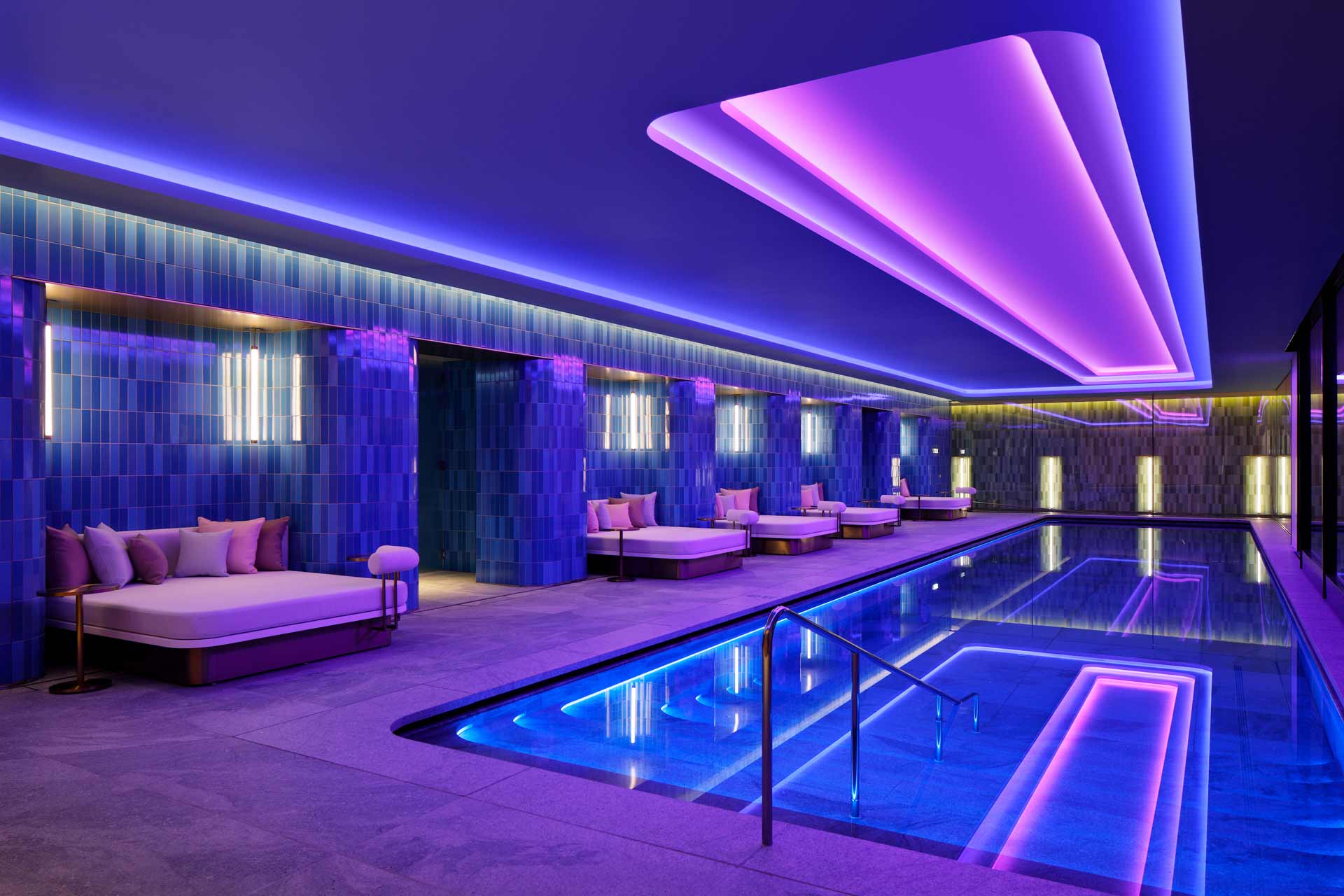
Inspired by the Japanese love for nature, the WET area is characterised by smooth walls and round corners. The endless line of the horizon is the simplest abstraction of nature. This line becomes a playful element connecting all the spaces on this floor, as a chrome horizon flows along the walls. Each area has its own character – color-coded in shades of green, grey, blue or pink tiling – defining the space’s function.
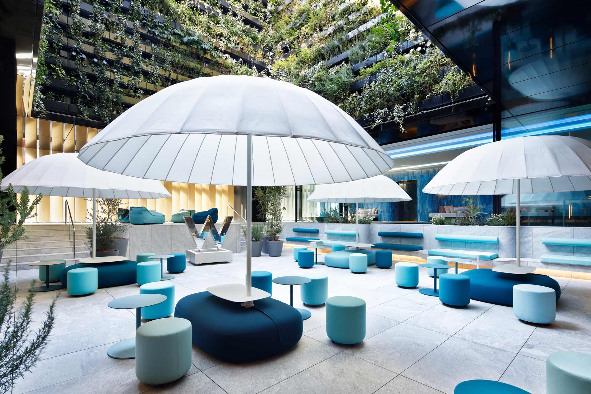
Open to the elements, with views of sky, the WET courtyard is an oasis, with live planting trailing down the walls of the atrium. From its elevated position on the horizon line, the pool forms a blue backdrop to this area. Directly adjacent to the courtyard, guests can grab a cocktail at the WET bar.
The colour theme of the guest rooms alternates per floor, between sakura pink and blue – allowing guests to choose the colour they prefer. The rooms consist of an open plan, with the living room, sleeping zone and bathroom separated by a contemporary glass shoji screen. Floor-to-ceiling windows bring in natural light and views of the city. A wall made of grey tinted two-way mirrors conceals an ‘escape’ lighting feature – when turned on, it transforms the room with dramatic pink or blue diagonal stripes, inspired by Osaka’s neon. Another surprise is locked away behind the walnut doors of the closets. Famous for their gamer’s pixel art, eBoy graphic designers created a “pixorama” of Osaka, filled to the brim with the city’s famous landmarks in full pixilated colour.
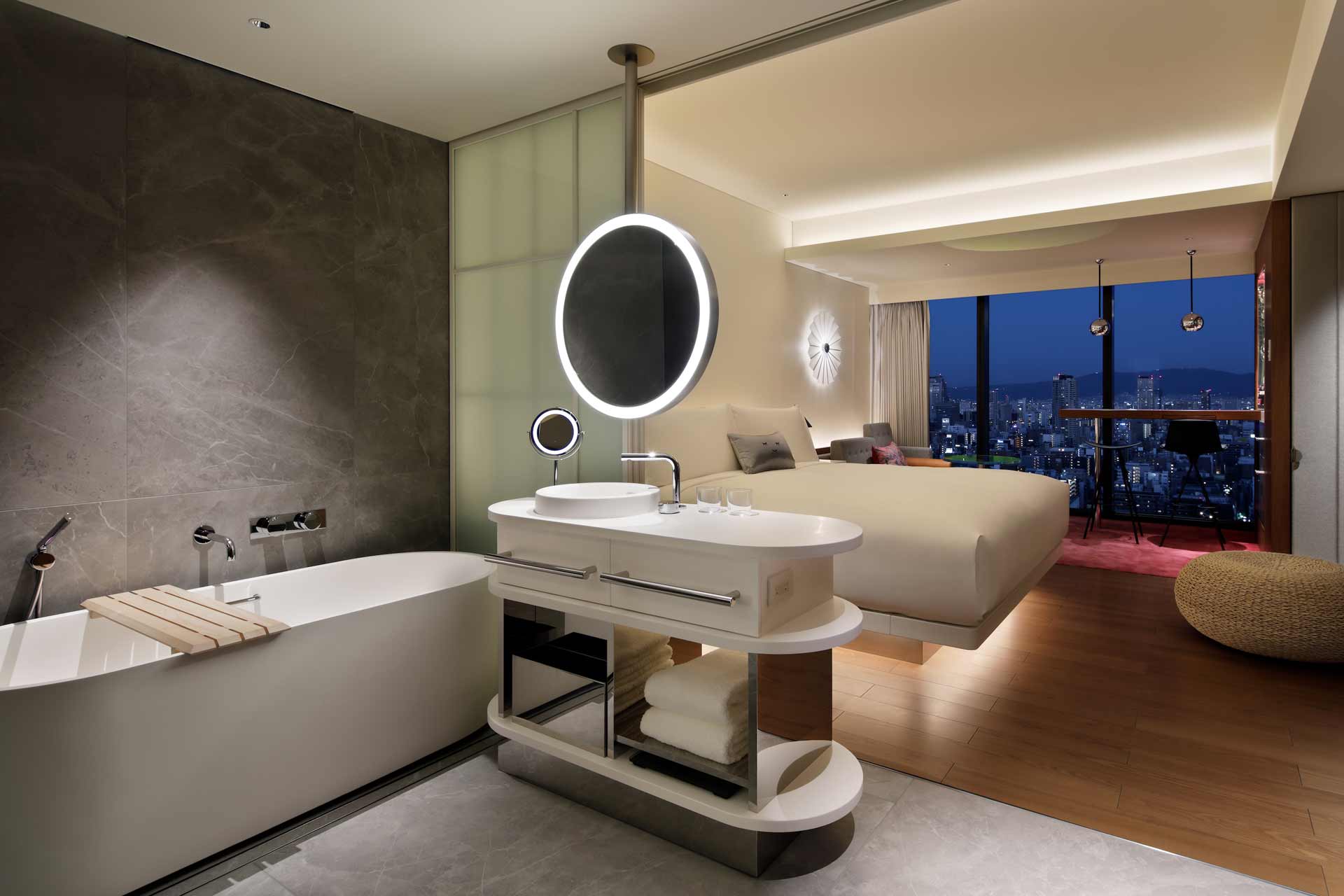
Having a semi-open bathroom offers guests the level of privacy they prefer – with the option of closing off the bathroom from the sleeping area – using the contemporary shoji screen. Clad in grey marble, the bathroom features a white, freestanding tub and a separate shower, located behind grey tinted glass doors.
In the centre of the room, walnut flooring demarcates the sleeping zone which comprises the king bed, bedside tables and black cone lamps – as well as the living room sofa. Behind the ledge, soft uplighting illuminates a white plaster wall. A round, rice paper lamp, inspired by Japanese fans, subtly glows on the wall, while a large tatami pouf sits at the foot of the bed.
Elsewhere, the Livingroom is defined by soft carpet in a gradient pattern running from pink (or blue) to grey. Each room has a sofa, two bar stools and a walnut cocktail bar, which can also serve as a desk. The bar extends into a niche lined with reflective, rainbow coloured dichroic film, with a mirror backsplash.
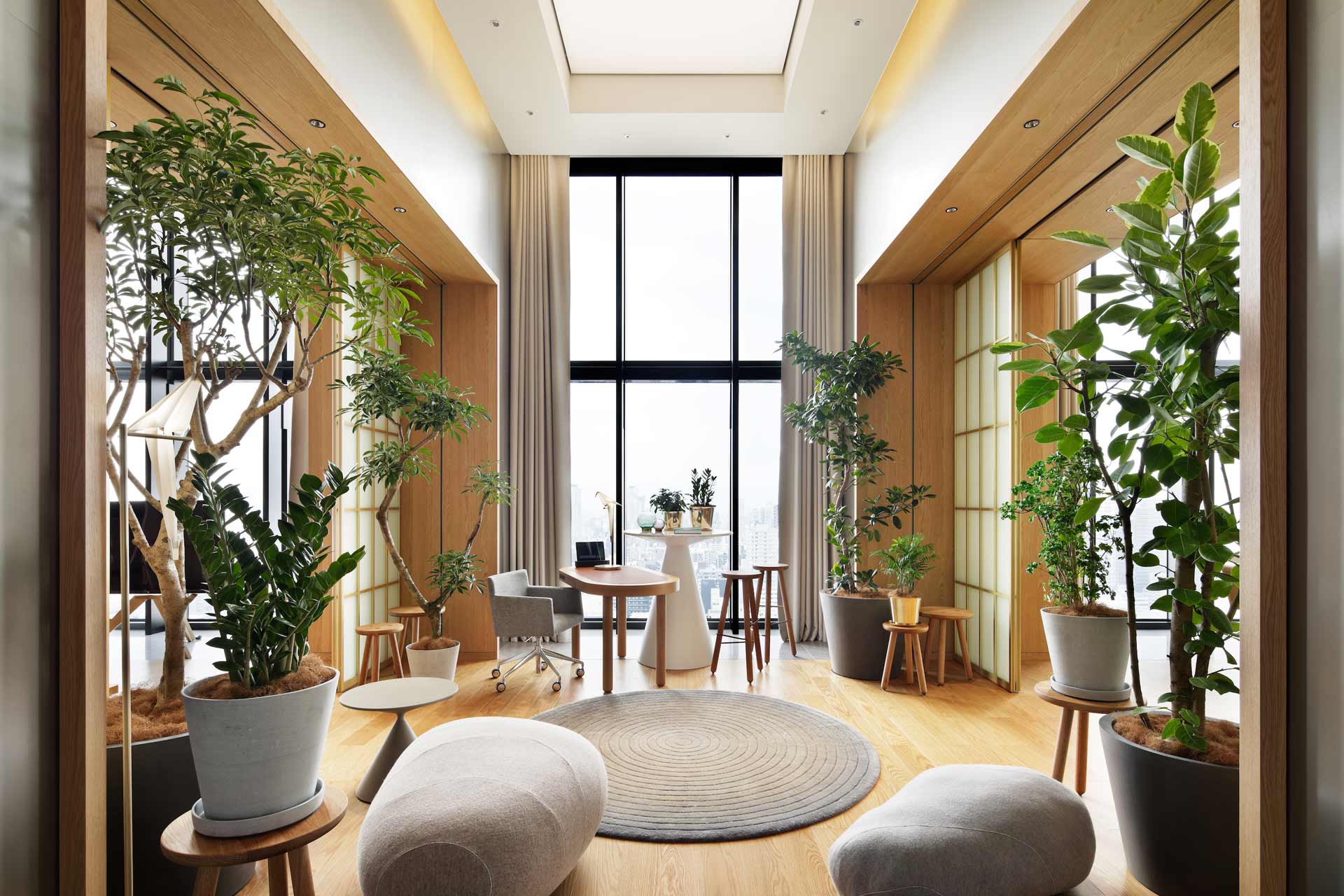
High above Osaka, on the 27th floor, the Extreme Wow suite looks out over – and beyond – the skyline of the city. Inspired by traditional Japanese homes, the suite was designed in a sequence of five rooms divided by deep, oak portals with sliding shoji screens that can be used to close off or open up the different rooms
The overall design concept is based on the duality of simplicity and extravagance, allowing guests to change the atmosphere of the suite. Whether they desire an intimate and personal ambiance or want to create a more extraverted setting for entertaining.
Related Posts
7 September 2020
Bergman Interiors design seven-star Nor Hotel
19 May 2009
