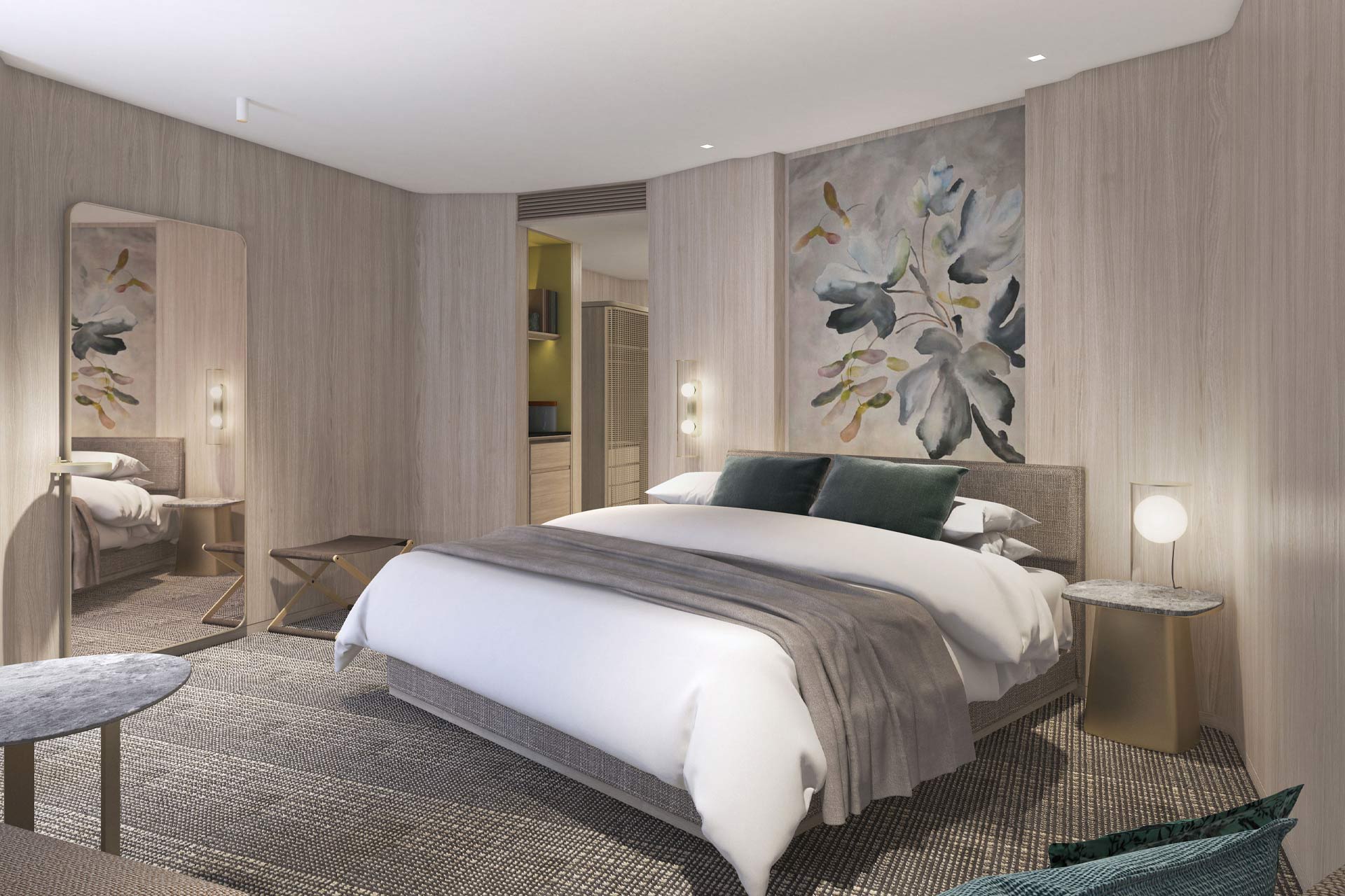
Opening in 2021 just across from London’s Liverpool Street Station, One Bishopsgate Plaza promises to combine world-class architecture, hospitality and design. Conceived by PLP Architecture, the 52,811m² development is centred around a 43-storey bronze tower comprising 160 private residences, a luxury Pan Pacific hotel featuring interiors by Yabu Pushelberg, and a public plaza animated by One Devonshire House, together with a separate space and mix of retail offerings, a destination restaurant and cocktail bar.
Ahead of next year’s opening, Sleeper caught up with Mark Kelly, Partner at PLP Architecture, to get an insight into the driving spirit and influence behind Pan Pacific Hotel Group’s first European outpost.
The Brief
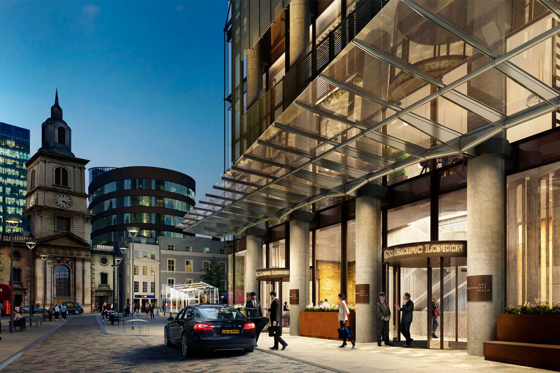
The genesis of PLP’s vision was to balance a design that is sensitive to the Asian heritage of the brand whilst creating an ultra-modern hotel that challenges conventional architecture. This ethos is manifested in the welcoming feel of the hotel’s entrance design, which echoes the geometry, patterns and shapes of the tower, inviting guests and the local community into the space.
“Though there wasn’t an Asian-Western intent behind the original design scheme for the site, connections to Asian architectural principles can be made because of the courtyard, the lightwell we’ve created between the buildings and the complexity of the façade,” says Kelly.
The fusion of Chinese architectural sensibilities is also showcased by the tower’s high-tech exterior skin, which relies on hierarchical symmetry and balance. Its form steps back as it rises to allow for an uninterrupted view of the Tower of London from Queen’s Walk at City Hall, providing terraces and other amenity spaces for residents and guests.
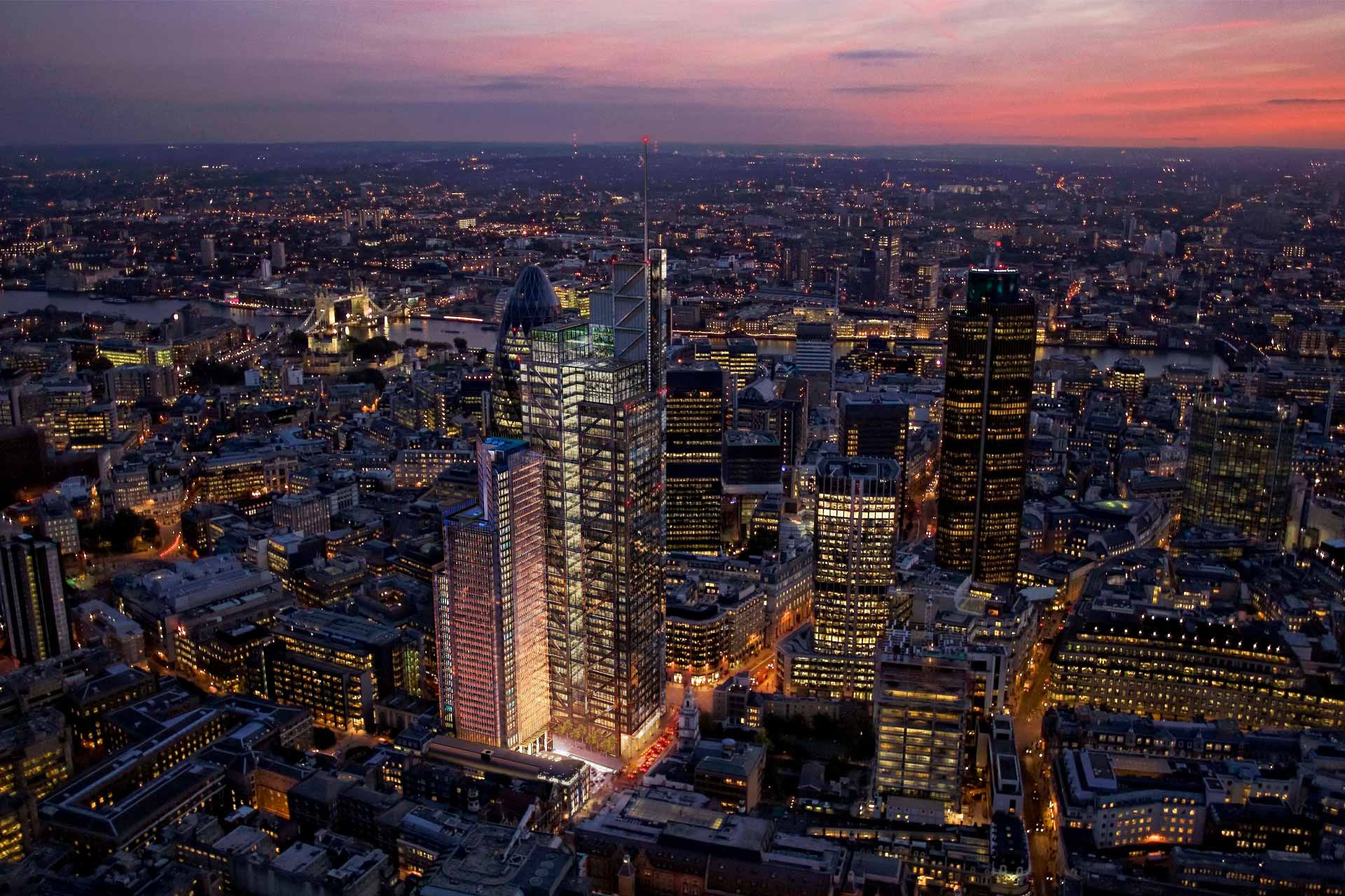
Above, in the tower, the anodised aluminium bronze coloured brise-soleil acts as a textural screening device, which allows the hotel’s appearance to change throughout the day and into the night as light and shadows shift, whilst providing contrast to the adjacent Salesforce Tower’s more solid form. The expansive glass panes and striking steel columns ensure the tower’s exterior design stands tall against the skyline.
As the tower wall reaches the ground, its hemline raises and lowers in order to accommodate lobby volumes, entrance canopies and other ground-level features.
Devonshire Row
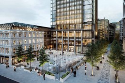
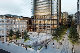
Connecting directly to a public plaza from the landmark tower is Devonshire Row, arranged to generate interstitial spaces such as One Devonshire House and a glass pavilion, housing an elevator and lift to take guests down to the events space.
“Devonshire Row consists of a series of Victorian buildings that were built as cut-and-cover tunnels over the Metropolitan line. The crown of tunnel forms our basement slab for those buildings, so we’ve taken the domestic Victorian architecture and given it a new lease of life,” Kelly continues.
Responding sensitively to the area’s architectural fabric, the stone and brick facades of Devonshire Row engage the neighbourhood at the street level, while the project’s architectural form in the tower complex embodies the dynamism of modern-day London.
A distinctive barrel shaped feature steel and glass panelling forms the roofing of the Devonshire Row building, which consists of a steel diagrid structure supporting 317 differently sized, diamond-shaped aluminium elements with glass and metal panel infills in anodised bronze colour.
An additional level of character is created through Devonshire House’s listed façade – a timber three bay windowed shop front, spot listed prior to the partial demolition of the building. Preserving some of the site’s rich history, the façade has been relocated to a new elevation facing the tower. For the rest of Devonshire Row, elements are being repaired using traditional timber craftsmen, recreating the existing frontage using original materials such as bath stone and pink granite columns.
Sustainability in Design
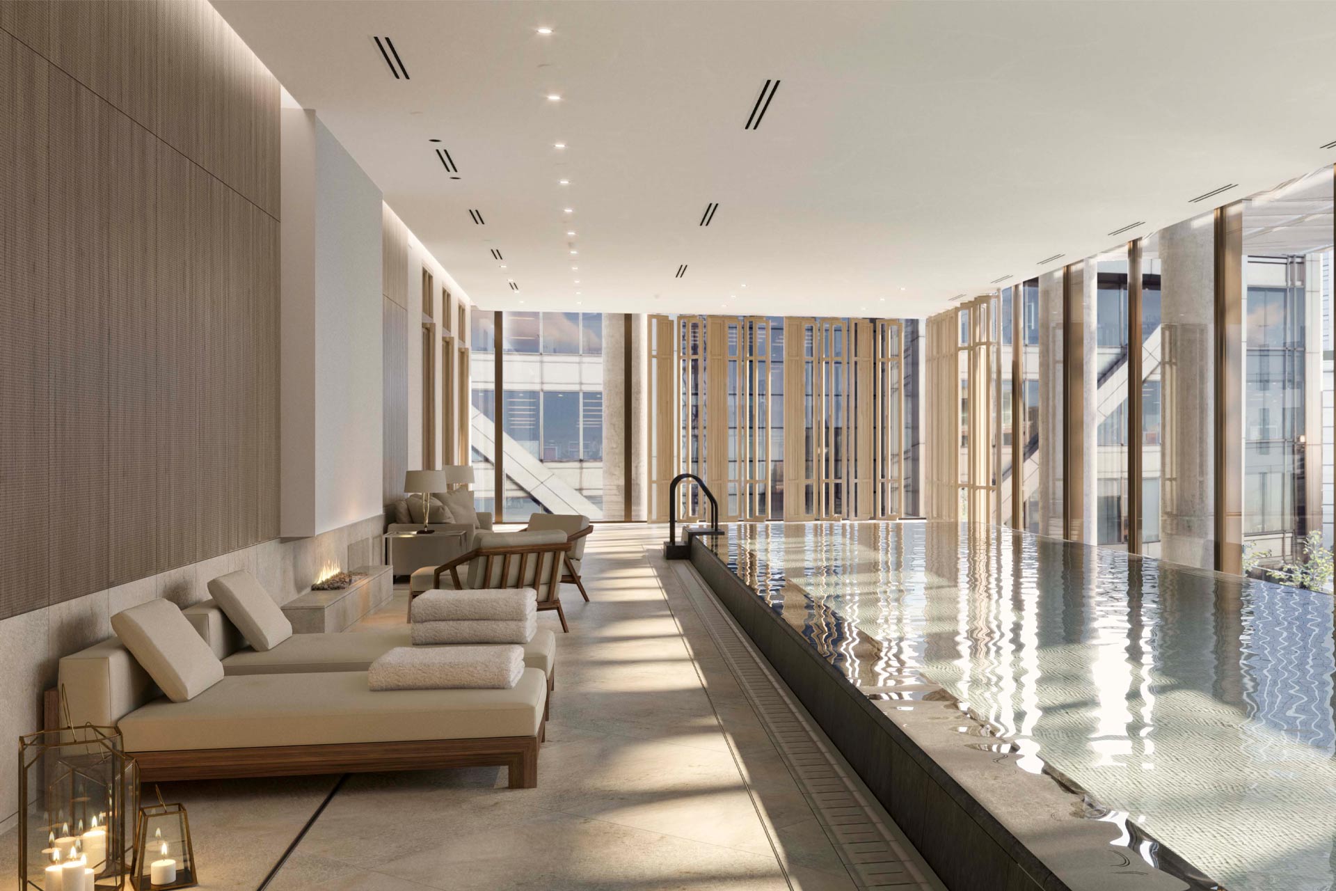
Sustainability also lies at the heart of Pan Pacific Hotels Group’s approach and encompasses every aspect of the organisation, including the architecture, design and operation of its properties. At Pan Pacific London, a mix of 42 native wildflower and some sedum species populate levels 34 and 42-44, protruding above the structure’s rooftop to create a sense of continuity between the tower and the outdoor public spaces and gardens on the ground floor.
PLP also included green roofs in the Sustainability Brief in line with BREEAM requirements, with the purpose of encouraging urban biodiversity and cutting carbon emissions from energy use by improving building insulation, reducing local flood risks and enhancing air quality. PLP are working closely with design partners and ecologists to plant and maintain habitats.
“Our architectural process can only be defined by taking into consideration modern parameters, understanding the essence of the area and conceiving its future. These notions imply guaranteeing the highest quality materials with a sustainable architecture that stands the test of time,” Kelly concludes.
“We want to embrace the city’s holistic goals of becoming a 24-hour destination for meeting, living, working and exploring. One of the biggest challenges is to create spaces that will be so inviting that they entice the local office community during the week and also the marketgoers and urban explorers at the weekends. Through a synthesis of indoor and outdoor spaces that are multi-level, mixed-use and green, we will effectively achieve this.”
Sleeper’s Assistant Editor Ben Thomas recently caught up with international design firm Yabu Pushelberg and Pan Pacific London’s General Manager Anne Golden to discuss the project’s interior spaces. To watch the webcast click here
Related Posts
13 January 2020
Pan Pacific to make European debut in 2020
1 Comment
Comments are closed.


[…] post PLP Architecture discusses the design of Pan Pacific London appeared first on […]