With guests largely unable to visit hotels in-person in recent months, projects across the scale have been relying on means beyond service and on-site experience to remain fresh in their minds. In this sense, projecting an identity without the usual crutches of tangible space and style, and without any local context, has become more important than ever.
For many properties, instagram posts, website hits and digital marketing campaigns have emerged as some of the few viable methods of achieving this, and properties that have been designed with a specific character and identity in mind have taken to translating these elements for the digital sphere. This began long before the pandemic, but this period of time has nonetheless demonstrated its importance.
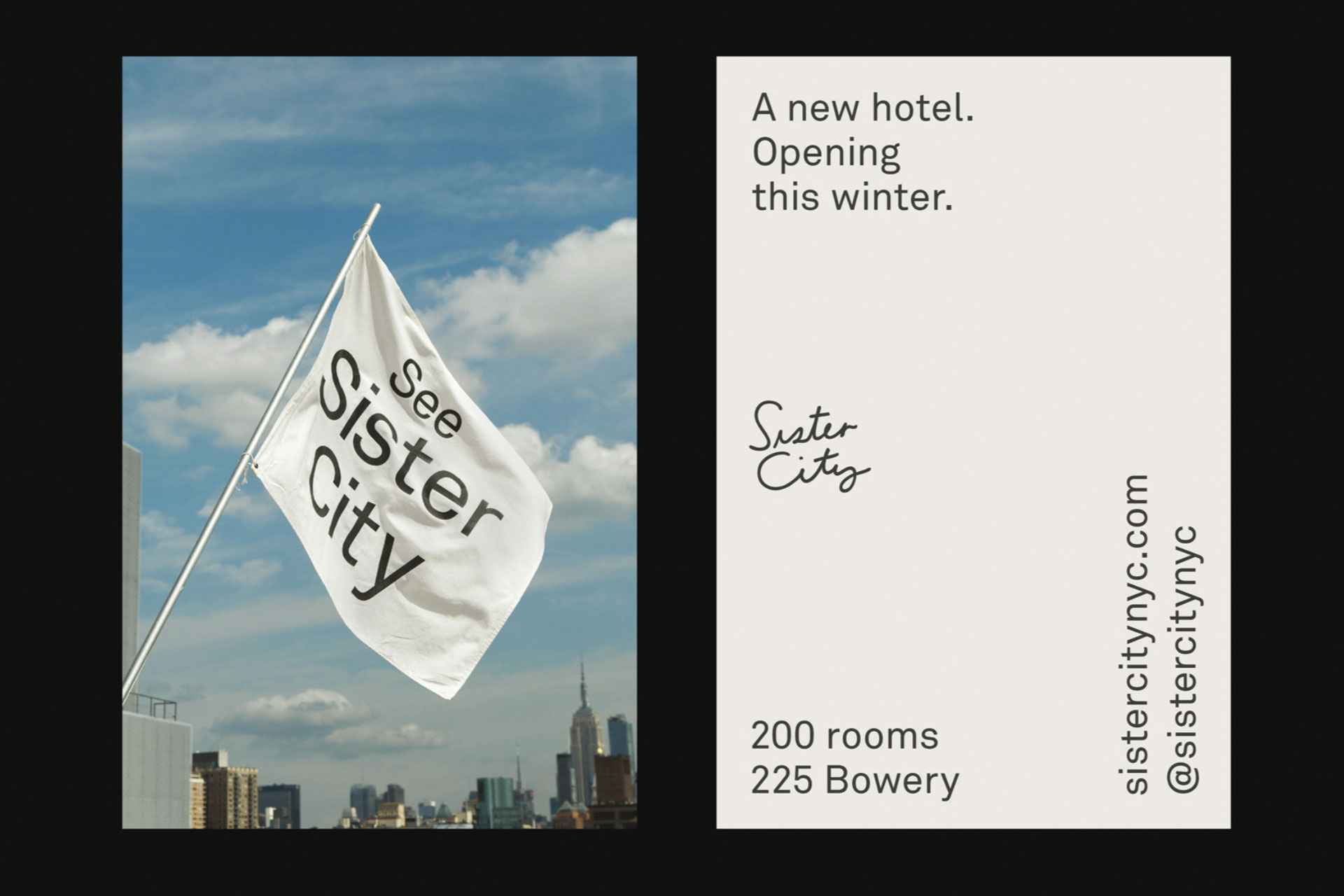
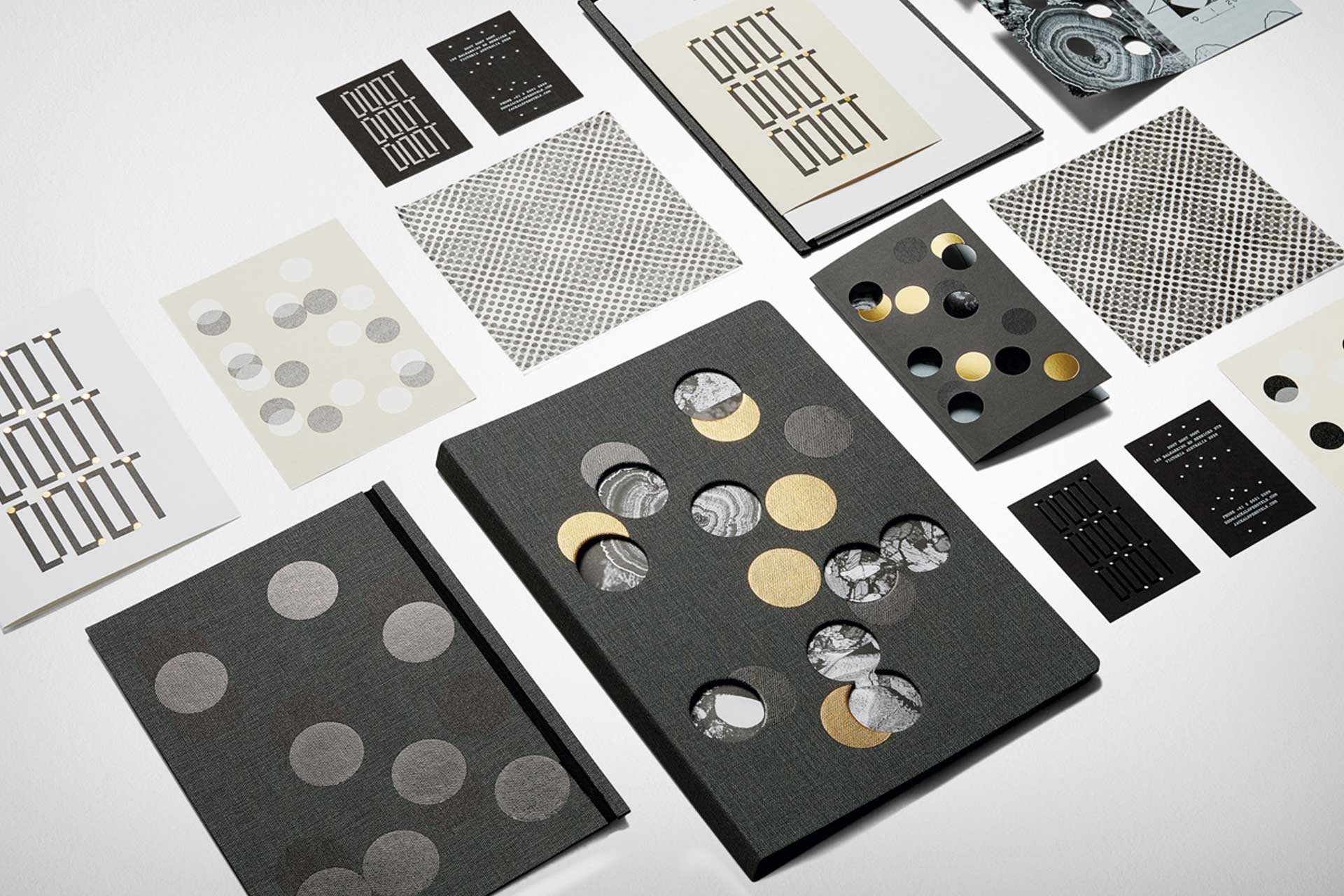
When guest return, there will inevitably be a gold rush of sorts, as hotels worldwide scramble to attract that first wave of eager travellers and kickstart their recovery. Projects that have spent this downtime carrying their branding through a coherent set of visuals, marketing materials and digital touchstones – designed to carry the hotel’s identity beyond its walls – will likely be best placed to capitalise.
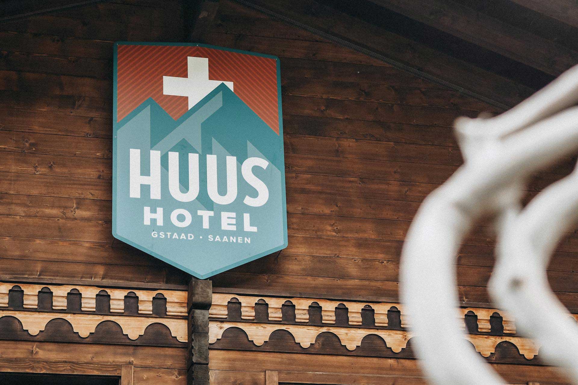
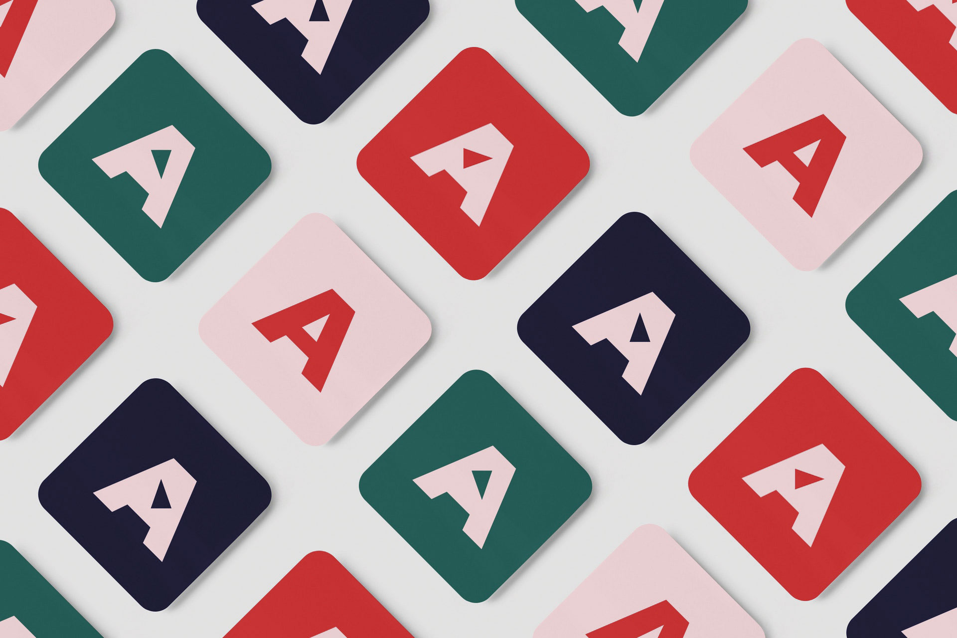
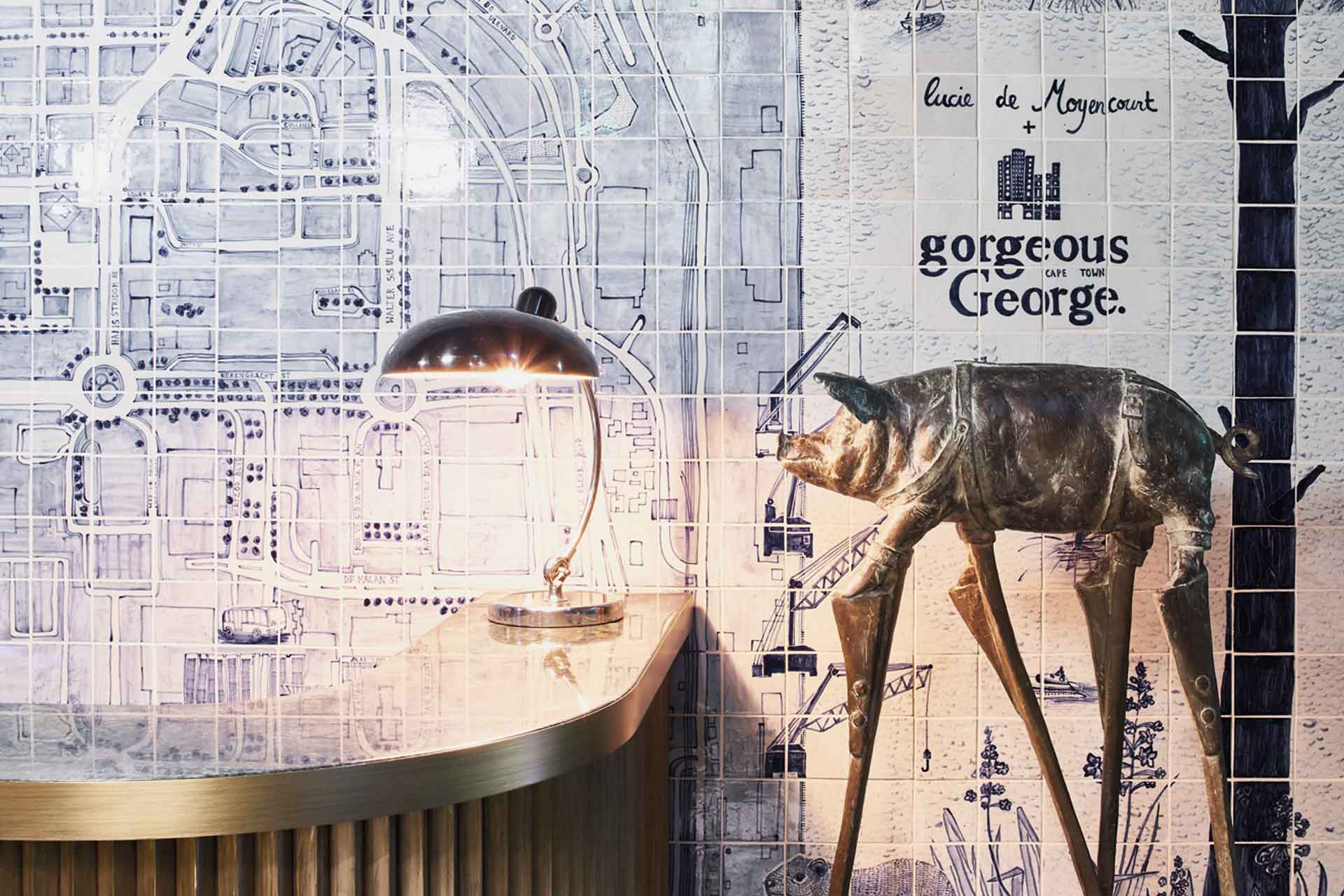
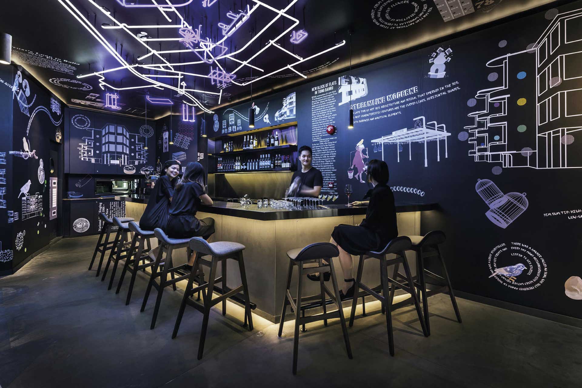
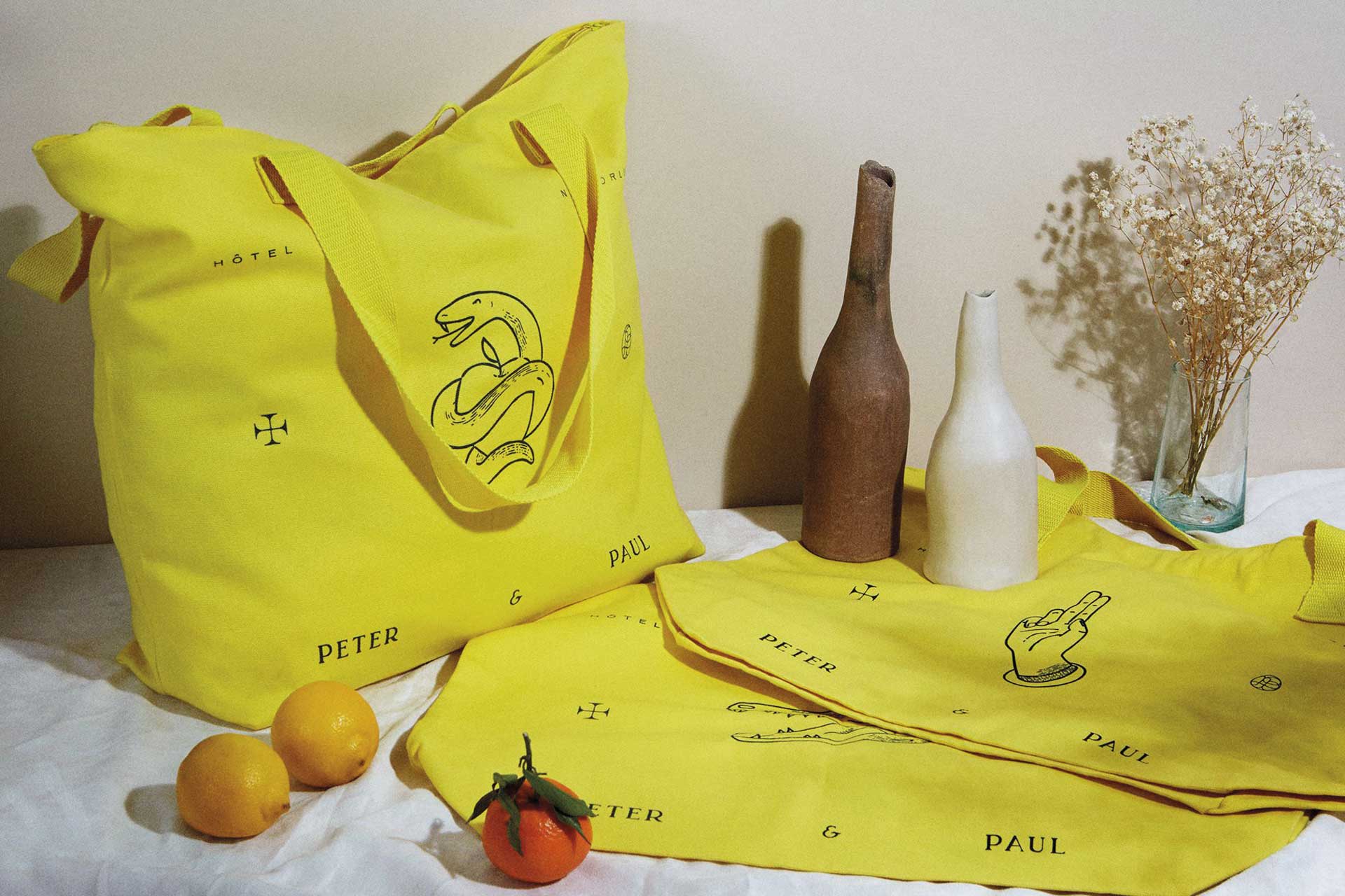
Often drawing from interiors for a sense of continuity, and in some cases designed by the same studio for added flow, a carefully considered visual identity can both complement and enhance a project, whist functioning to tie details found in architectural or interior elements to a digital presence.
Click through the slider below for the best examples of hotel visual identities.
Amerikalinjen - Oslo, Norway
Oslo’s 122-key Amerikalinjen occupies the grand former headquarters of The Norwegian American Line, with both interiors and a substantial package of carefully considered typography, logos, visuals and graphics nodding to a retro-chic past and contemporary Scandinavian minimalism. A palette of pastel pinks, greens, reds and blues weaves shades of the American and Norwegian flags together, whilst the venerable cruise legacy is referenced subtly within the ‘A’ logo – within which a compass arrow point will turn to face the direction of the hotel when viewed on a phone anywhere in the world.
Sister City - New York, USA
Winner of the AHEAD Americas 2020 Visual Identity award, a set if materials for New York hipster haven Sister City draws from the highly-curated back-to-basics styling of the Atelier Ace venture by way of handcrafted touches and a healthy dose of irony-tinged fun. Channelling the bare-bones essential through a lens of contemporary cosmopolitan cool, Sister City’s catalogue of imagery and brand materials would look equally at home on an album cover or gig poster as it does on the property’s website.
Gorgeous George - Cape Town, South Africa
Spanning an Art Deco structure and an adjacent Edwardian building, Cape Town’s Gorgeous George is rooted in a fusion of styles. Paying homage to this contrast, as well as the urban boutique’s contemporary industrial leanings, the visual identity scheme comprises details including a bold serif font splashed across Delft-inspired ceramic tiles; a curated selection of locally-sourced modern art; and a eclectic palette of reds, pinks, greens and midnight blues – all reflective of the distinct Tristan Du Plessis-designed project.
Jackalope Hotel - Mornington Peninsula, Australia
Tied closely to the darkly abstracted interiors of the Carr-designed Jackalope Hotel, Studio Ongorato’s enigmatic visual identity scheme extends beyond the typical packet of postcards, menu covers and palette curation to touch and enhance almost every point of the project. A complete aesthetic vocabulary encompassing Rorschach tests, Blade Runner-esque neon geometry and processed imagery of surreal landscapes and bursting stars, the bold approach is typified by a mysterious void-black bunny sculpture greeting guests at the entrance.
COO - Singapore
Seeking to appeal to millennial travellers with a vibrant take on local imagery and architecture, Ministry Of Design’s identify scheme for COO – a hostel/bistro hybrid launched in 2017 – draws heavily from the hotel’s interior, whilst building on the futuristic neon styling with a suitably hi-tech dedicated app. COO Connect, created in collaboration with BBH Labs and Blacksheep Live, allows guests to interact with each other digitally through group chats prior to their stay.
Hotel Peter & Paul - New Orleans, USA
Set within the restored former St. Peter and Paul Catholic Churches in New Orleans’ bohemian Marigny neighbourhood, the StudioWTA and ASH NYC-designed, 71-key Hotel Peter & Paul turned to Paris- and New York-based art director Alizée Freudenthal for its visual identity scheme; a marriage of the church’s historical legacy and nods to the project’s playful character. Think matchboxes printed with illustrated crocodile skulls, witty reinterpretations of religious texts and a palette of lemon yellow, pastel pink and forest green.
