REVIEW: The Middle House
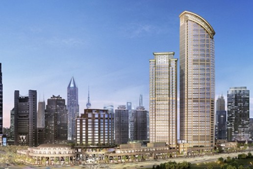
Shanghai’s current hotel boom continued this spring with the opening of Piero Lissoni’s The Middle House. The two towers it occupies form part of a Swire co-owned development that includes office blocks, a shopping mall, the world’s largest Starbucks and the city’s new Sukhothai hotel. Wong & Ouyang Architects designed the masterplan and footprint of the whole complex, while Lissoni Associati was in full charge of the hotel’s design; there was no competition – Swire commissioning on the strength of his studio’s previous hotel work.
The entrance journey for the hotel is signposted by bamboo planting and two walls of green bamboo-motif tiles along the driveway in front of the building.
The hotel’s exterior façade features a series of rounded aluminium louvres, which provide shade and privacy while creating a textured aesthetic that visually distinguishes it from surrounding developments. Looking up at them, the two towers are a little foreboding, clad in dark grey aluminium, a colour that Lissoni remembered from past visits to China and the roof tiles used on old buildings.

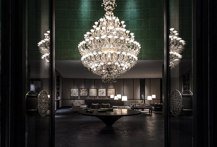
Guests arrive at the hotel’s glass box entrance that leads into a green-tiled room dominated by a six-metre-high, 3,760-piece chandelier created by Fabiano Zanchi. The effect is dictionary-defining ‘dramatic’.
“I’m interested in connecting east and west and there are two different worlds at play here in this green room,” Lissoni explains. “You have the special ceramics on the wall made in China, and then there is this Murano glass chandelier made in Venice. I wanted to represent the honourable connection between west and east, between Venice and China, between glass and ceramics and in a romantic way, Marco Polo was very much in my mind.”
From here, the L-shaped lobby and reception area opens up, decorated in muted tones with an informal collection of large homely sofas, tables and lights, which in design terms allude to the hotel’s tagline of ‘Our House, Your Home’.

Lissoni took inspiration from the city’s rich heritage of craftsmanship and culture, marrying his minimalist style with classical Shanghainese elements. The majority of furniture has been designed by Lissoni and made bespoke for the project, with the exception of a few classic and original Scandinavian designs in guestrooms – chairs and small tables – including some from Saarinen. Other pieces come courtesy of Stellar Works and continue the theme of east-meets-west.
This combining of different design languages is important to Lissoni: “I have been fascinated by the classical, traditional materials from China – we found the best artisans and materials such as the tiles – and then I also redesigned some Chinese furniture with my western eyes. I like to be in China, but at the same time I reinterpret what I see. This level of ‘contamination’ is present in all our projects, and in Shanghai too. I like the idea of cultural contamination because it reflects the way our world has been influenced – in a good way!”
Upstairs, the hotel’s main restaurant, Café Gray Deluxe, comes from long-term F&B collaborator Chef Gray Kunz. It’s a handsome space using the same bamboo tiles, this time in black, with Richard Winkworth paintings on the walls and a long sweeping terrace that provides outdoor space.

Guestrooms meanwhile showcase Lissoni’s European eye: full length day-drapes on the windows, dark wood floors with rugs, ceiling pendant lights, floating sofa-benches and glass-walled bathrooms stocked with Claybrook tap- and bathware. These elements are offset with artwork from young Chinese artists, backlit screens, and modern reinterpretations of traditional Chinese furniture including oriental-style nightstands. The thick brocade cord of a master light switch hangs from the ceiling bedside, which is referred to as ‘Mr Goodnight’ and is a practical alternative to the problem of searching around for a small bedside table button.
Across from the hotel is the 14-floor residence building, with 102 short- and long-stay apartments. Here the approach is much more low-key.
There’s a ground floor Italian restaurant with a front-facing patio rose garden, and once inside the front lobby, the drama of the hotel’s chandelier is replaced by a surprisingly thin, sweeping three-floor staircase. “Whenever I design something around the world, if I have to connect floors, I love to incorporate staircases – they are my signature,” says Lissoni. Here he’s made use of a self-supporting spiral structure clad on the outside in black metal and on the inside in oak. It’s a perfect complement to the brick walls – thin shikumen grey bricks found in Shanghai’s old lane houses, but assembled here in a modern design.

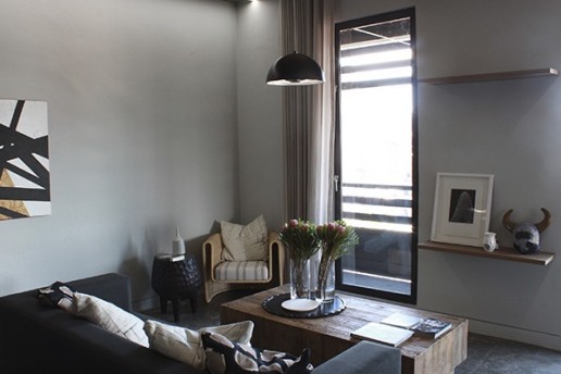
The residence rooms are similar in tone to the hotel guestrooms, but feel more open and Sino-influenced. This is due to a sliding wood screen between the bedroom and living areas with a hexagonal motif that Lissoni refers to as technological bamboo. He notes: “Being a guest in a hotel is different from being a guest in an aparthotel; here you have to feel much more at home when you open the door. So the layout – the entrance, kitchen, living room and bedroom – is more like a house. I used the same materials, but in a lighter more familiar way; in the hotel they’re used in a more dramatic way.”
The residence building also contains two restaurants: the ground floor Italian, the only interior space not designed by Lissoni – instead done by the F&B team – and a first floor Chinese restaurant with an upstairs lounge. The spa, gym and pool are housed in the basement of both buildings, connecting them. Here exterior stone materials are used for the internal walls and natural light floods the large plunge pool at one end, while the adjacent 33-metre swimming pool is placed within a much darker set of hues.
“When you’re in Shanghai, you notice that the light during the day is not sensual, instead you get this strange milky light. So I tried to provide some sensuality in the space with candles, lamps and the dark atmosphere. The darkness in my mind is not heavy, rather it’s sophisticated and gives an atmospheric feeling. I’ve used darkness to control the city’s natural light otherwise everything becomes completely flat.” This acknowledgement and recognition of the quality of the city’s light is indicative to the thought, detail and design Lissoni has imbued into this project.
Words: IJ Miu
Images: © Edmon Leong
This article originally appeared in Sleeper 80
Related Posts
16 July 2018
Cameron Design House details LDF collaboration
29 June 2017
Swire Hotels announces The Middle House
18 May 2015


