REVIEW: Sister City
20 years since redefining hospitality for the creative class, Ace Hotel Group launches a new concept orbiting values of minimalism and autonomy.
Stepping into Sister City, guests are greeted with a lobby score composed by experimental musician Julianna Barwick. Whilst artistic installations in hotel lobbies are now a staple of boutique and branded project alike – shorthand beyond furnishing and palette for what is to come – Barwick’s work here is different.
A collaboration of sorts with music technologist Luisa Pereira and an artificial intelligence system developed with Microsoft, the process sees cameras placed in the hotel’s roof sending information – gathered data pertaining to clouds, weather, airspace or simply the presence of a pigeon perched nearby – down to mingle with pre-recorded washes of Barwick’s ambient sounds for a perpetually changing soundscape, one that reacts, in real time, to the atmosphere and goings-on of its locale, 24-hours-a-day. The name of this particular game is ‘Circumstance Synthesis’.
As the latest venture from Atelier Ace, the studio behind Ace Hotels, Sister City lands in New York’s Bowery neighbourhood with many of the same goals as its parent brand – mainly to provide the youthful, creative class with suitably cool surroundings.
However, the creative Generation X-ers of Seattle, 1999 – the first guests to experience the Ace portfolio – are a much different affair to the creatives of 2019, New York City. As such, some adaptation was required.
The property is located on the thoroughfare of Bowery’s eponymous main street, set back behind an inconspicuous concrete wall and brass gate, a short walk from both music venue Bowery Electric and the modern art of New Museum. If the location alone isn’t a sufficient enough indication, Sister City has a specific guest in mind, and Atelier Ace has immersed itself in all the elements and ideas that will draw them in.
“We were guided by the philosophy of less, but better, and sought to design our platonic ideal of square one,” explains Brad Wilson, President, Ace Hotel Group. “We asked ourselves what was truly needed when travelling, but filtered it through the lens of human-oriented technology and mindful design. While Sister City shares Ace Hotel’s love for people and places, it distils it to a different form of compassionate hospitality — one that is more autonomous, tech-oriented and minimal.”
Inspired by the precise Scandinavian functionality of Finnish saunas, the streamlined curation of Japanese Bento Boxes, and John Cages’ 4’33 – the infamously silent piece that sees the audience’s reaction to the absence of music become the song itself – the design is the result of stripping back the contemporary hotel offer to its bones, retaining only the beautiful and the necessary.
Accessible either through a slender alley off the street, where casual seating unfolds behind the covert gate, or a neatly arranged pocket garden to the rear – this guest-only door leading to a typically graffiti-clad Nolita back-alley – the property is a quietly confident alternative to the influx of heavily-branded Manhattan contemporaries.
 © Brian W. Ferry
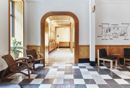
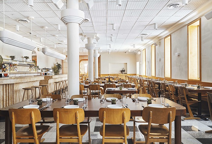
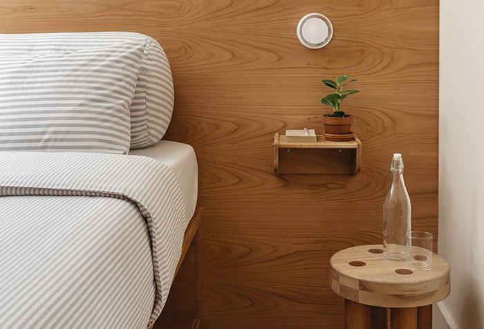
Within, the aforementioned score sets the scene for a breezy palette of white and wood, the few pops of colour provided by the shelves of plant life, and light bouncing off textured tiles placed sparingly amidst the chequerboard underfoot. Wooden arches built within the slatted wall adjacent lead guests into Floret, a ground-floor restaurant where these touchstones are translated as a curving wooden bar facing seating punctuated by a row of white pillars. Headed up by chef Joe Ogrondnek, Floret completes a fluid welcome that circulates through tranquil exterior and interior without much interruption.
“Sister City was designed entirely in-house by our team at Atelier Ace, and we were looking for idiosyncratic ways to take care of people and respect the place we’re in,” Wilson notes. “The hotel acts as a sort of urban oasis in the district, a place that quiets the din and cacophony the Lower East Side is famous for. As such, we planted flora in both our garden entrances to organically transition you from the street into the space, and our outdoor restaurant patio for Floret feels miles away from Bowery.”
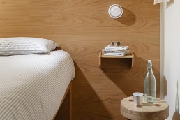
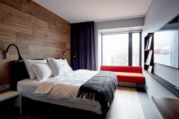
These gentle transitions define much of the hotel. The steely exterior architecture is mirrored in industrial-style elevators, whilst the steadfast palette climbs alongside, spilling into guestrooms from bunk to single to king to terrace, the latter with coveted skyline views. Whilst these spaces follow a trend of smaller guestrooms padded out with style emergent across New York, the combination of a clearly defined minimalist aesthetic and the project’s less but better ethos sees them at once emptying the design of distractions and highlighting the complex work that lies beneath.
“The rooms at Sister City needed to be cleverly designed, so we looked to modular furniture and multi-purpose pieces for inspiration, and played with scale, proportion and minimalism to let each individual element shine,” Wilson explains. “The TV cabinet folds down to become a desk; the valet becomes a transformative catchall for individual needs; the bed frame acts as a storage unit and the terrazzo vanity grounds the room as a central visual cue that’s both elegant and utilitarian.”
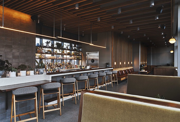
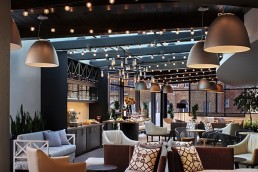
High above sits Last Light, the hotel’s rooftop bar. Another indoor-outdoor hybrid, similar in tone to that set previously, Last Light is differentiated by darker shades of wood, and linear takes on the curving staples of the lobby. Wrapped in tall windows and shaded with steely blues and greys, the scheme here acts as a sleek counter to the casual tones below. A terrace around the exterior is smartly divided into a social square smattered with rounded tables and seats, and a quieter stretch to the back, both with panoramic views towards Manhattan or One World Trade Center.
However, whilst all the essentials are present – and by design the only thing present – it is, like Barwick and Glass’ music, the notes Sister City doesn’t play that makes it stand out. Affording guests a large degree of independence to create their own experience, a similarly minimalist approach to service sees an automated check-in seamlessly integrated into the lobby – the kiosks clad in the same light wood as doorframes – and guest pantries located on each level, revealed as alcoves at the turn of corridors. Staff are there to help of course, but first and foremost this is a hotel for guests to discover themselves.
“It’s designed to appeal to the traveller who appreciates independence, intuitive technology and self-guided hospitality, with its balance of functional design and aesthetic mindfulness acting as a springboard for guests themselves to animate,” Wilson concludes. “In Lecture on Nothing, John Cage said ‘I have nothing to say, and I am saying it, and that is poetry, as I needed it.’ Sister City, while stripped of excess, is poetic in form and function, and we followed Cage’s concept in spirit, paying meticulous attention to detail and focusing on how form, simplicity and craft can be poetry in one of the busiest cities in the world.”
Having made waves with its casual tone and light-touch offer, the first Sister City has already achieved the most difficult instance of circumstance synthesis, that is to say it has a sector often opposed to branded offers excited about a brand.
And whilst the aesthetic may change for future locations – “we can imagine Sister City in similarly dense, design-forward, global locations like Tokyo, Copenhagen or Hong Kong,” Wilson muses – the core idea has already demonstrated that Sister City is more than adept at adapting to the world around it.
Words: Krisofer Thomas
Photography: © Adrian Gaut (unless otherwise stated)
This review originally ran in Sleeper 86
Related Posts
25 January 2018
Atelier Ace creates Sister City
5 May 2017
Ion City Hotel opens in Reykjavik
10 February 2015
