REVIEW: L’Oscar
Transforming a former sanctuary into a hedonistic London hideaway, Jaques Garcia channels Oscar Wilde for the seductive, art-laden L’Oscar.
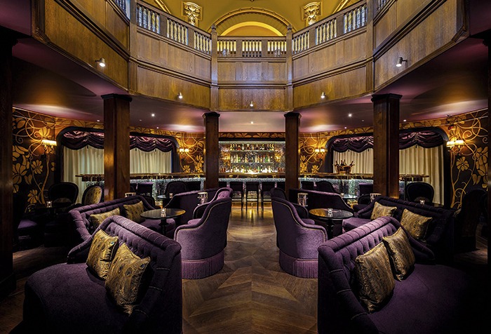
Dark, moody, opulent and decadent, the interiors of L’Oscar hotel in London’s Holborn closely follow one of the many epigrams of playwright Oscar Wilde: ‘Moderation is a fatal thing. Nothing succeeds like excess’. Indeed, the hotel is a riot of quality materials and patterning that has been paradoxically incorporated within the former London headquarters of a most puritanical order, the Baptist church. What was once a sanctuary is now a hedonistic bolthole.
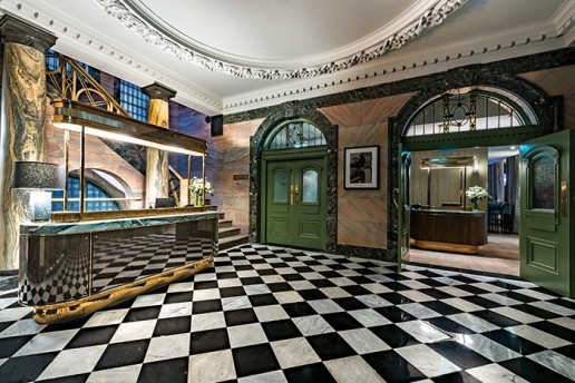
However, the original building – designed by Arthur Keen and completed in 1903 – was a not a study in reductivism. Far from it, the style of the day being Edwardian Free Baroque with its exaggerated façade detailing, lively silhouettes and central domes. Keen drew together a mixture of influences including the Arts & Crafts movement’s finer touches and ornate plaster ceilings with stone fireplaces and extensive wood panelling. As such, the property is Grade II-listed by Historic England; only 2% of their listed buildings holding this highest status.
Overlaying this history are the new sumptuous interiors by Parisian designer Jacques Garcia, who knows a thing or two about luxurious hospitality environments. His work at Hôtel Costes in Paris has been a reference point in the field of boutique hotel design for the last quarter century, and his studio’s work ranges from grand dames such as La Mamounia in Marrakech to the NoMad projects of the Sydell Group. The building was acquired in 2012 and is owned by a consortium of international investors, primarily Triangle Hotels & Resorts led by Duncan Shakeshaft.

Shakeshaft invited Garcia to create his “seductive interiors”, showing him three possible London alternatives with the Holborn property selected. The brief was put together by Shakeshaft but the design intent is Garcia’s interpretation. Nevertheless, Shakeshaft has been involved in certain details of the project – selecting the restaurant’s china and influencing the Fashionizer-designed uniforms which meld the old-school elegance and formality of velvet smoking jackets for the male waiters, and shimmering organza fabrics adorned with feather brooches for the ladies. Shakeshaft even sourced the stylised peacock motif doors that lead to the Baptist Bar from a scrap-metal dealer in France, whilst British firm PPS aided in the sourcing, procurement and installation of all FF&E and OSE items, as well as the wide variety of furniture, upholstery, fabrics, and ephemera.
Interpreted across wallpapers, upholstery and murals are aviary motifs, with the peacock especially prevalent. So too aubergine tones, dominant in the overall dark palette. General Manager Michael Voigt quips: “If you don’t like peacocks and aubergine then L’Oscar is not for you.” This is a hotel with a point of view. And Garcia’s point of view is based on a number of convictions. He was taken by the history of the building, and revisited the Oscar Wilde ideas he first used at the Hotel des Beaux Arts in Paris two decades ago. “The concept design is a blend of the structure and history of the building and the modernity of new colours, fabrics and so on,” explains Garcia. “Really important was the use of colours that you wouldn’t think about mixing.”
Indeed, alongside the aubergine fabrics by Osborne & Little and Pierre Frey are flashes of crimson, deep yellow and vivid blue ceilings to highlight the white original stucco. Adding to the peacock motifs is an extraordinary amount of patterning, in the rugs by Tai Ping, the silk rope bannisters and tassels, the embossed detailing of the leather wallpaper by Atelier Meriguet that was applied in 0.5m² ‘patches’, and the literal thousands of dome-headed metal upholstery studs.
“The mood boards were an improbable combination of colours and patterns but have come together as a piece of art,” describes Voigt. Indeed, artworks are writ large across the property. “We wanted to weave a story about the original period of the hotel and its location connected to the Bloomsbury Group,” explains Peter Millard of art consultancy Peter Millard & Partners.

Having worked with Garcia before at the Vagabond Singapore, Millard knew the richness of Garcia’s aesthetic, selecting and commissioning pieces to fit. The artwork reflects the late Victorian and early 20th-century eras; even the frames are “period perfect” asserts Millard. Newly commissioned busts of the Bloomsbury Group’s Woolf, Carrington and Keynes adorn the busy lobby shelving.
The artworks required special attention when it came to lighting due to the hotel’s overall dark ambiance. As Sally Storey of Lighting Design International (LDI) explains: “By day the hotel had to be quite moody. By night even moodier.” For LDI, whose remit was for all lighting except for decorative elements, it was a major challenge to meet this brief whilst still ensuring guest and operational safety. For example, in the staircase the luminousness of the central light feature was still unknown, so skirting strip LEDs were introduced to light the treads. Of particular note are the spectacular back-lit onyx bar in the street-level Café L’Oscar, and the warm amber sparkle points on its geometric, antiqued mirrored ceiling panels.
The lobby is a good illustration of the breadth of LDI’s skills with coffer ceiling lights, downlighters illuminating artworks and seating, linear LEDs shining on the silk aubergine drapes and shelving, as well as the incorporation of dozens of up-lit frosted glass birds. Designed by Garcia, some 495 of these Lalique-style pieces were fabricated by Zonca of Milan, a favourite of Garcia’s. Other repeating elements by Zonca include delicately pleated lampshades for wall, table, pendant and standard lamps.
The historic aspects of the property threw up some ingenious solutions: a guestroom is linked by a glazed walkway to its bathroom in a separate turret; the use of huge, upholstered screens to create bathrooms where permanent structures were not allowed; and the incredible cupola of the original chapel that soars above the Baptist Bar & Grill has its ‘Tree of Life’ stucco detailing accentuated using uplighters carefully inserted by LDI. The whole dome can be lit in different colours to change the atmosphere.
Elsewhere, a selection of lighting solutions by Chelsom – including guestroom and bedside LED lighting as well as the large side-lit bevelled mirrors in bathrooms – were designed with a touch of decadence to complement Garcia’s seductive scheme.

The original structure sees two major interventions, one being the creation of an additional two floors, and the second being the new mezzanine balcony that separates the ground-floor bar, with its crackled glass-fronted counter, and becomes the restaurant above. Helmed by Executive Chef Tony Fleming, the food is outstanding, served gueridon-style at the table-side. This culinary skill has helped the success of the event spaces – The Committee Room and Library, both stacked with historic elements.
Taking some six years to be realised the hotel feels complete and rounded, and even in the details there are moments of interest. Silver napkin rings sourced from Sandbury Antiques Market in Kempton Park are brought to life beside the hotel’s feather emblem, seen in collateral but also waste-bin detailing, whilst toiletries by English-born Roja Dove are centred on Wilde’s favorite flower, the carnation.
There is also a deliberate humility in the overwhelmingly lavish interiors. Some of this comes from the listed elements, such as the simplistic graphics of the Arts & Crafts tiling around guestroom fireplaces. And there is a calmness in bathrooms whose relative decorative sparseness, barring the magnificent array of marbles used, provides a relief to the extravagance elsewhere.
L’Oscar is another new landmark on London’s ever-burgeoning hotel map. As dramatic as, but also dramatically different from The Mandrake, and like the Nobu Shoreditch, it also has a brand proposition, with Shakeshaft envisaging the global expansion and development of L’Oscar International, with projects shortlisted in Europe and the Caribbean.
Garcia asks for his work to be treated as haute couture, a description of which Wilde would have approved. And it is convenient to conclude with another of Wilde’s epigrams, originally regarding the nature of man, but applicable here to hotels, too: ‘It is absurd to divide humans into good and bad. They are either charming or tedious’. The absurdity of L’Oscar within a Baptist church has the hotel “a little on the edge” remarks Voigt, but there is no doubt the finished product is in the charming camp.
Words: Guy Dittrich
Images: Courtesy of L’oscar
This piece originally ran in Sleeper 82
Related Posts
14 January 2020
Feature: Stock Exchange Hotel, Manchester
7 June 2019
REVIEW: Shinola Hotel
30 November 2015


