COMPANY PROFILE: RH
With the opening of its New York gallery marking a new chapter for RH, the American furniture maker completes a transformation two decades in the making.
When entering RH’s New York gallery, visitors are presented with a carefully arranged visual motif. Through a frame of four pillars and as many chandeliers, the gaze is drawn to a central welcome desk, then to the column of a glass elevator beyond as it ascends to the building’s canopy. Mezzanines run parallel either side, emphasising a singular corridor of perspective, whilst the furniture showcases closest to the door are mirrored in placement. Down to the elevator cords, the image is one of exceptional symmetry, all precisely calculated to focus the viewer’s eye on this specific moment before their subsequent mapping of the gallery’s various settings, spaces and facilities.
Whilst visual correspondence and equilibrium are nothing new in retail design, this specific moment has roots in a value that has perhaps driven much of RH’s success since the turn of the millennium.
“I saw all these buildings and intersections and things where I thought: those are the proportions I want. That’s what I like,” explained Gary Friedman – RH CEO since 2001 – to The New York Times in 2012, in reference to trips taken to Paris, Florence and Rome, and the enlightenment, of sorts, which the European style provided. “It gave me a lot of confidence in the way I saw the world. I was Vitruvian before I even knew about Vitruvius.”
Elsewhere, in a letter on the RH website, he expands this angle with reference to the wider company: “We, like Vitruvius, believe the most pleasing environments are a reflection of human design. They are a study of balance, symmetry and perfect proportions. It’s a discipline of addition through subtraction, where less becomes more, and calm is created through continuity. The result is a design where the whole becomes more valuable than the parts.”


Preoccupied not only by visual symmetry, but human symmetry – that is, how human beings interact with the presence of balanced proportions – RH has chosen to begin the journey through its store with this image not simply to stun its customers, but, in a way, to wear its heart on its sleeve. As such, more than a simple handshake introduction before the shopping begins, stepping into RH New York, The Gallery feels more like a dive into the ideas at the core of the brand – a gleaming, six-storey portrait of the American furniture company’s current iteration.
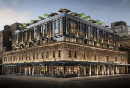
Set on a corner of Manhattan’s quickly rising Meatpacking District amid repurposed factories and former industrial structures, RH’s latest gallery finds something of a spiritual home in the borough’s southern portion, with both the surrounding area and the company having undergone significant change over the previous three decades. Where the Meatpacking District saw crime and drug activity flourish after the industrial decline of the 1980s, the 1990s and onwards saw a flock of high end boutiques and young professionals claim the area, with the zone now host to the trendy Whitney Museum of American Art, Soho House’s New York outpost and some of the highest rents in the city.
In parallel, RH – previously Restoration Hardware – has undergone a similar degree of transformation. Established in 1979 by founder Stephen Gordon as a source for affordable, high-quality fixtures, the company expanded to some 50 stores before it began trading publicly in 1998, then to 100 by 2001. However, with sales falling and the need for a new perspective becoming more pressing, Friedman – fresh from being passed over for the CEO position at home and kitchen giant Williams-Sonoma – joined to unlock RH’s full potential.
Following a change of hands and Gordon’s stepping away, Friedman took to implementing a steady programme of transformation. As such, the years since have seen a rebranding that had RH shed all but its two key initials, as well as expansion into the outdoor, children’s and contract sectors. Following executive announcements in 2010, the brand topped-out this phase of change with an entirely new focus, and a redirection into more upmarket styles and price points. Now firmly established in the upper crust of international interior design thanks to product presence in acclaimed hotels, residences and public spaces worldwide, the opening of RH New York, The Gallery marks the culmination of a narrative that has seen Friedman help the company to really flourish.
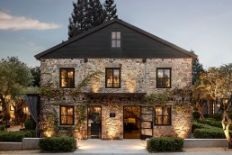
The gallery itself is the product of a seven-year design-and-build process, and, along with the similar-in-concept but far-removed-in-tone RH Yountville – where the gallery portion is complemented by a prominent food-and-drink element – now forms the latest venture in RH’s quest for perfect balance. Both join existing gallery experiences in Chicago, Toronto, Palm Beach, Boston and Portland amongst others, but feel like a step up in terms of scope. The curious thing is this: in a retail landscape that has largely told us bricks-and-mortar is dead, here is a company in the process of building these kinds of legacy projects around the globe, and performing better than ever despite the gloomy outlooks of those around it.

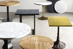
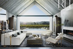
With levels dedicated to each of RH’s sub-brands in RH Interiors, Modern, Baby & Child, Teen, and Outdoor, the 90,000ft² space sees visitors guided through room-sets and showcases formed entirely of its own designs. The symmetry of its entrance shot is translated within these rooms off the main atrium as stylish living spaces, foyers, dining areas and study sets, most drawing prominently from the current source book – the brand’s seasonal bible outlining its expansive catalogue of pieces. The Thaddeus Forged Brass collection, the wooden bamboo range of richly finished tables by Wyeth’s John Birch and Timothy Oulton’s Cloud sofa all make appearances.
As much as it is a space for guests and visitors, members of the RH Interior Design team have taken up postings here too, occupying a sleek office on the second floor and presentation rooms nearby. Further, the space’s achievements have drawn members of the design community in too. Exploring the gallery’s various floors, Sleeper encounters two prominent designers working within the hotel sphere, one on their way to a project meeting with RH collaborators, whilst the others headed to lunch on the rooftop, where a glass-enclosed space lined with small trees and chandeliers – outfitted with prime cuts from the floors below – tops the project.
As much as it is an exercise in retail, the gallery is also a depiction of the intangible values of symmetry, balance and human experience that Friedman and RH value so, and with a mix of shoppers casually browsing, designers hurrying to meetings and the company’s own presence through the embedded design firm, the space captures a genuine, layered social buzz.
However, the change is far from over. Across the road, visible from the east wall of the leafy restaurant, is an old brick building from the district’s industrial past. Taking place within is a hidden process that will see it transformed into what is currently rumoured to be the first RH Guesthouse, bringing together the gallery’s retail achievements with the experiential offer unique to hospitality.
Details are currently scarce, as they were for the gallery during its conception, but by tapping into a quickly evolving hotel sector the move could not only see RH add another major facet to its brand, but the presence of a new player on the hospitality scene – one with detailed knowledge of hotel design through its contract arm – which could prompt major players to reassess how they balance commerce and human experience – an act of delicate symmetry in itself.
Words: Kristofer Thomas
This piece originally ran in Sleeper 82
Related Posts
26 November 2018
RH unveils RH Yountville
5 December 2016
RH launches Restaurant Collection
18 November 2016


