Branding & Visual Identity
From graphics on menus to guest greetings, a hotel’s visual identity and branding has the power to convey experience far beyond its walls
Whilst interior design and a hotel’s physical presence can go some way to creating experience, memory and emotional resonance, it is often the all-important first impression away from the property that encourages potential guests to become paying customers. From digital graphics designed to be widely shared on social media to the creative wording of a do not disturb sign, visual identity and branding has the capacity to at once create a defined character for the hotel and reinforce its place in people’s minds, ensuring a consistent and coherent set of values and visuals for them to reference, paying guest or otherwise.
“A visual identity is a tool that unifies a hotel experience by encouraging recognition and reassurance across different communications,” explains Mark Jory, founder of Latitude, a creative branding agency with studios in London, Dubai, Singapore and New York. “More important than the visual identity is defining a clear and confident voice and point of view that engages with guests.”
Distilling the essence of a chain or individual property into materials that function in tandem with the hotel, the task of branding and visual identity designers is to convey the ideas that a stately façade or sleek, modernist lobby cannot, and to create emotional narratives that will raise awareness, drive engagement and ultimately form the hotel’s presence beyond its walls. The increasing focus on visual identity and branding been identified as an important aspect in the creation of new hotels, leading to the introduction of a new category for AHEAD. The awards scheme has since recognised projects including Australia’s Jackalope and Shanghai’s Amanyangyun for the visual language accompanying and elevating their offers, and the resulting connections generated between guest and hotel.
“It is this emotional connection with guests that nurtures brand loyalty and the decision to return – in the same or different capacity – recommend, or visit a different hotel of the same brand,” Jory adds.
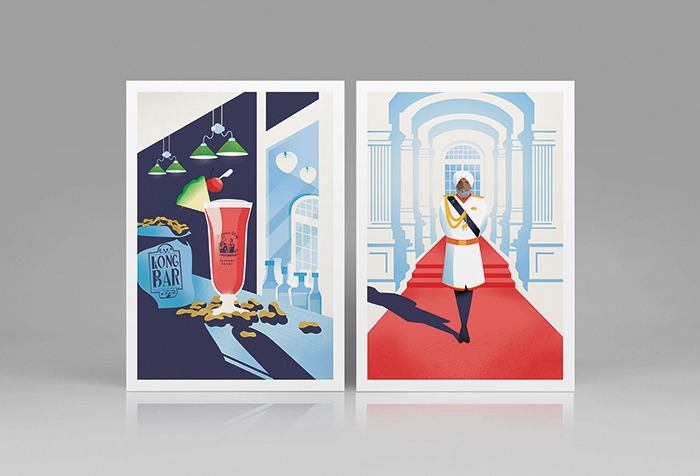
Driving the decision to return formed the basis of Latitude’s work for the iconic Raffles Hotel in Singapore, a commission encompassing the design and production of a graphic campaign indented to continue the story of the property during its 18 months of renovation closure. Whilst it is unlikely that anyone who has visited the property would forget the experience, icons nonetheless require maintaining, and the series of postcard illustrations the agency created serves to at once keep the Raffles brand fresh in the mind and build anticipation for its new era, depicting key messages and imagery from the traditional Sikh doormen and famous Singapore Sling to the tall, white-pillared lobby and air of golden-era sophistication. The postcards act as a grand tour of the hotel whilst it is unable to host a tour of its own, further appearing on boarding surrounding the construction site to remind passers-by of its imminent return.
“Our illustrations took their cues from the visual language of the era in which the hotel was established and built on this iconic heritage brand, but took it into a contemporary place whilst still sitting comfortably with the existing Raffles Hotel Singapore identity,” notes San-San Chan, Managing Director Europe, Latitude. “As the reopening approaches, we have also created an extended campaign that turned the illustrations back to photography, showcasing the rich brand imagery originated by Jenny Zarins.”
This ancillary form of hospitality design has become integral to hotels in an age where luxury travel is perhaps defined more by experience than it is by material goods. The necessity of this complementary presence saw Hirsch Bedner Associates (HBA), one of the more prominent international hospitality design firms, launch its HBA DNA dedicated branding division in 2018, working from the ground up with new concepts looking to make inroads into the crowded market, or as a resource for established names in need of a repositioning or update.
“We always start with where we are – the hotel’s location, its surroundings, history and future,” explains Gustavo Neri, Visual Identity Director, HBA DNA. “It could be what the city is known for, a famous personality that hails from there, a sports team nearby, an invention or even a fictitious character. During our initial meetings we seek to find out why the client selected the property, what makes it special to them and then delicately weave the brand standards in with this vision for a narrative that is both strong and subtle.”
At The Marshall in Berkeley, California – a member of Hilton’s Tapestry collection – HBA DNA worked within and beyond the hotel, creating a brand programme covering everything from the formal logo adorning the front door to digital collateral, all with a concise thread of narrative, colour and tone woven through. Based on a fusion of historical and contemporary elements, as well as interpretations of Berkeley’s inhabitants and academic associations, the package saw ephemera from guest directories to do not disturb tags develop from a single idea at the heart of the project.
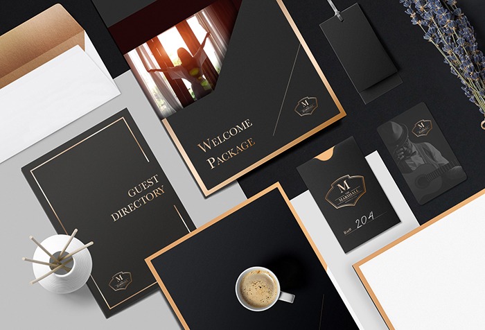
“During our first phase we took great care in researching the original owner of the property and discovered it was a cement mason from the area dating back a century ago,” Neri recounts. “While walking the streets of Berkeley in search of inspiration, we came across that cement mason’s stamp on the sidewalk and it was like striking gold – that tiny bit of information ultimately informed the branding package as a whole.”
Paying similarly close attention to landscape and surroundings, London-based branding agency The Plant created a pair of identities for two disparate Four Seasons properties in the group’s metropolitan Ten Trinity Square London location and Astir Palace Hotel on the Athens Riviera. The former is interpreted as complex and detailed architectural illustrations by Thibaud Herem printed across collateral – as well as objects including a knotted rope door hanger in a nod to the building’s nautical past as a naval office – whilst the latter (pictured, top) draws more from the tranquil nature of its coastal setting, resulting in a visual character centred around delicate, single-line drawings of florals flowing gently through menus, in-room amenities and digital marketing materials.
A strong example of how the medium can so clearly differentiate two hotels within the same established brand, the experiences inherent to each project are conveyed through subtle aesthetic interventions, informing the audience of each hotel’s carefully crafted identity before they even set foot within.
“The interiors, the history, the architecture, the environment, the smells, the service – the best identities tie it all together,” notes Matt Utber, founder of The Plant. “It should simply communicate the experience in a way that’s beautiful and memorable. Due to social media, guests are now much savvier when it comes design and branding, so a disjointed visual identity will weaken your story and therefore connection to the guest.”
However, the work doesn’t stop when the project opens its doors, rather the practice shifts to more subtle and less physical elements of branding, as Cara Federici, Founder of The Madison Melle Agency, explains: “I think a lot of what is overlooked in branding is the guest experience and how the staff work together to deliver the brand message clearly in all aspects of their day to day work. From what they say and how they say it – such as “Welcome Mr. Jones” for a formal brand experience vs “Hi, Jack, I’m Suzie” in casual laid back setting – to what they wear and how they are groomed. Hotels that have a really strong brand message don’t only deliver it well online or with a great physical design, but they nail it in all these areas.”
Whilst the physical and collateral branding of a hotel is undoubtedly key in its success, there are nonetheless elements of the process to consider long after the property opens its doors, perhaps overlooked, or not noticed at all in most cases, yet integral contributions to the seamless experience. The best branding, after all, is the branding you never even realise is there.
www.latitudeagency.com
www.hba.com
www.theplant.co.uk
www.madisonmelle.com
Words: Kristofer Thomas
This article originally ran in Sleeper 85
Related Posts
18 November 2015
IHG signs Hotel Indigo London – Aldgate
15 June 2015
NLA Awards – Shortlist announced
29 October 2013

