Room2 unveils Southampton project
Room2, a new brand that seeks to blur the line between definitions of home, hotel and serviced apartment, has revealed its Project Orange-designed Southampton location, occupying a former office block with amenities including studio rooms, communal living rooms, bar, café, lounge and an informal reception bar.
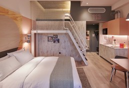
Billed as a “hometel” the project is situated in the old port area of the city, which attracts 1.5 million cruise visitors a year and marks one of the cruise capitals of Northern Europe. The brief given to Project Orange was to challenge the perceptions of the standard apart-hotel offer. As such the project involved stripping the building back to its structural frame, affording generous typical room sizes of over 30m². The removal of the former offices’ large ceiling voids also enabled the inclusion of mezzanine decks for family friendly rooms that line the South side of the building overlooking the adjacent Queens Park.
“The design for Room2 is informed by what makes Southampton successful today,” says Christopher Ash, Director, Project Orange. “Without being overly literal we wanted the design to take reference from the seafaring history and present economic drivers of the city. Visible in the exposed joists and etched portholes of bathrooms, the mezzanine stairs, netting installations, cosy spaces in the bedrooms, and the exposed mechanical services against the nautical tones of the public areas, we believe the result to be a unique, fun and playful sense of character that distinguishes the hotel from the many others in the city.”
Bedroom colour palettes are split floor by floor throughout the hotel and offer guests a choice between coral and aqua schemes coordinated through bathrooms, kitchens and soft furnishings including feature fabric and plywood headboards. Colour is used graphically throughout with a recurring theme of horizon line datums.
“The obvious starting point for the project was its role as a port and association with great cruise liners past and present,” Ash adds. “Whilst this informs the concept the intent was never for it to become a themed interior. The nautical references are limited, occasionally literal but more often nuances – colours, details, materials and the occasional graphic. The design has a spirit of travel, optimism, and sunnier climes. Departure and arrival inform the design.”
The principle design move for the public areas involved stripping out the ground floor to create the signature living room, and, whilst, unified through a graphic cement tile floor, zones are defined by permeable screens of reeded glass and white steel tube populated with plants, forming a mixed environment. A series of new vitrine style protruding windows with integrated benches further unifies the space whilst adding diversity to the seating choice and creating a strong visual link to the park across the street.
Related Posts
28 November 2018
Omni unveils Louisville project
18 April 2017
London Design Fair unveils 2017 details
15 December 2016


